Two systems
The photographs use different lenses, so this exercise compares finished rendering rather than isolating sensor and film alone.

The Leica M9 CCD beside Kodak color film—two ways of translating the same Hawaiian light.
Two photographs, made moments apart. One with the Leica M9 and the other with the Leica MP using Kodak Ektacolor 160. Look at skin, foliage, blue fabric and sand before revealing the answer.


After selling my Leica M11 and returning to the Leica M9, I wanted to move beyond the familiar mythology of “CCD color.” The useful question was not whether the M9 is better than a modern camera. It was whether its color and texture could be mistaken for a film stock I know well.
I photographed closely related scenes with a Leica M9 and a Leica MP loaded with Kodak color film. The photographs were made moments apart, but not with the same lens. This is therefore an observational color comparison—not a laboratory test under perfectly identical optics.
A color reference card established a common starting point. The film scan was white-balanced in Lightroom, then modest exposure, contrast and vibrance adjustments were used to compare the images—not to crown a winner, but to discover where their visual languages overlap.
These photographs show how the Leica M9 and Kodak Ektacolor 160 interpret another Maui scene: white fabric, warm sand, tropical greens, skin and reflected ocean light.


Because the camera position, moment and lens differ, compare the overall palette and emotional rendering—not edge-to-edge sharpness or geometric alignment.
| Characteristic | Leica M9 CCD | Kodak color-film scan |
|---|---|---|
| Skin tones | Natural and surprisingly film-like after modest balancing. | Gentle, familiar color; the initial scan appeared warmer. |
| Reds & blues | More saturated—especially vivid reds, ocean blues and blue-greens. | More restrained, with softer separation between strong colors. |
| Sky & teal | The sky leaned more purple-magenta; teal shifted more blue. | A quieter palette shaped in part by the film scan. |
| Texture | CCD noise had a surprisingly organic appearance. | Film grain stayed distinctive, yet the two textures could feel close. |
| First glance | Once balanced, several pairs were genuinely difficult to identify without careful inspection. | |
The photographs use different lenses, so this exercise compares finished rendering rather than isolating sensor and film alone.
Both cameras worked in the color, contrast and reflected light of a Hawaiian beach.
A color target helped bring the M9 DNG and processed film scan to a comparable baseline.
“The M9 is not Portra 160. But after modest corrections, the family resemblance is much stronger than I expected.”
LAURENCE BALTER · FIELD CONCLUSION
The practical finding is clear: photographs made moments apart with the M9 and Kodak color film can appear remarkably close after modest balancing. Stronger saturation remains the clearest M9 tell, while skin tones and overall texture can be unexpectedly convincing.
It does not prove that Kodak engineered the M9 CCD color filter array to imitate a particular film. The lenses differed, and a processed film scan is already an interpretation. Exposure, optics, chemistry, scanner profile, lab choices, white balance and Lightroom adjustments all influence what reaches the screen.
Watch on the largest color-calibrated display available, make your choice, then tell us how many frames you identified correctly. The hesitation is the most interesting part.
After modest white-balance and tonal adjustments, the Leica M9 and Kodak color-film scan were surprisingly difficult to distinguish at first glance. The M9 remained more saturated, particularly in reds, blues and blue-greens.
No. The Leica M9 and Leica MP photographs were made moments apart using different lenses. This is an observational comparison of finished images rather than a controlled lens or sensor test.
No. The resemblance is worthy of examination, but the test cannot establish Kodak's intent. Optics, film processing, scanning, exposure, white balance and post-production all affect the final comparison.
The M9 was generally more saturated, especially in reds, blues and blue-greens. Skin tones and the visual texture of CCD noise versus grain were often closer than expected.
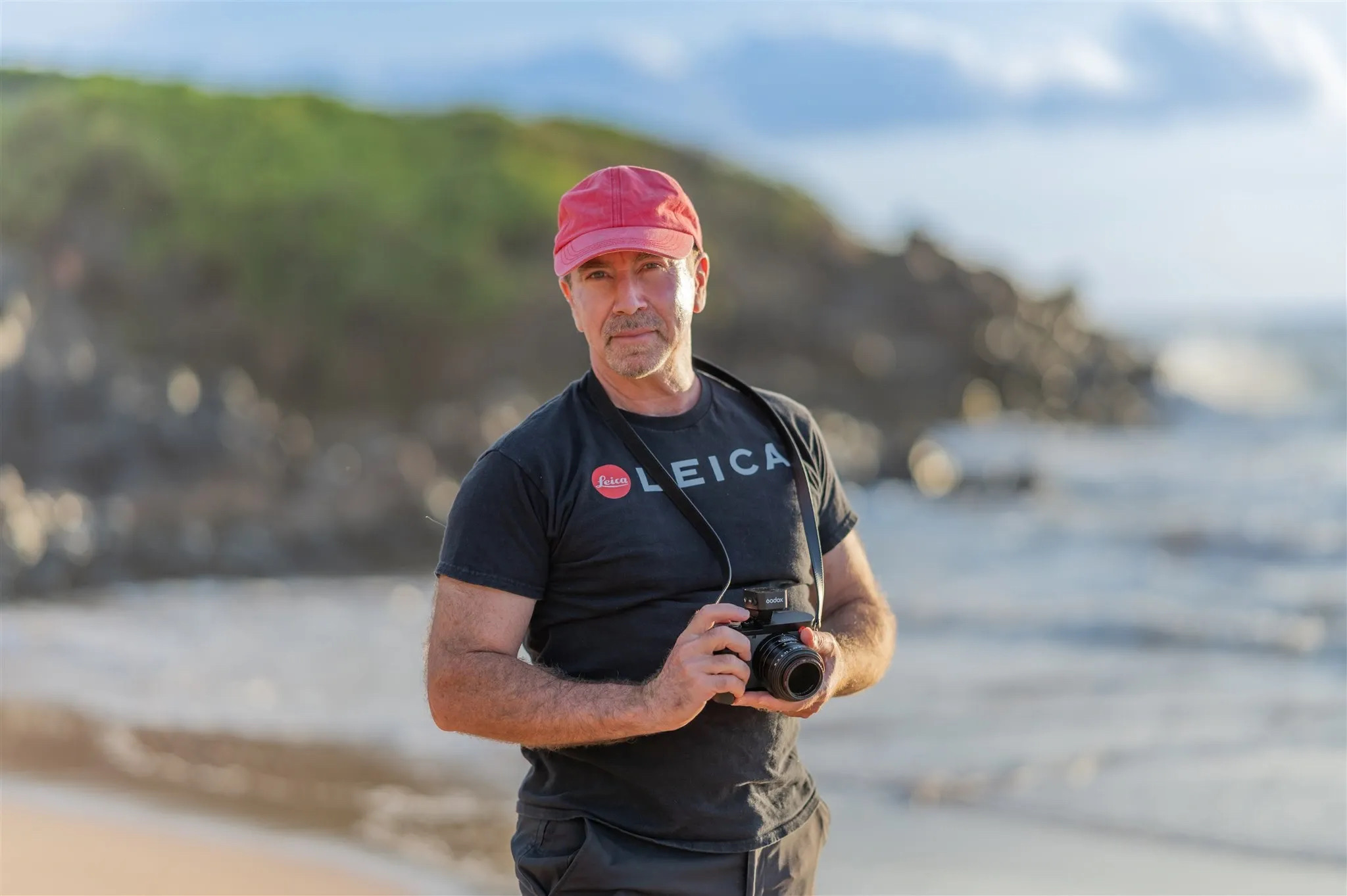
Laurence founded Wailea Photo more than 25 years ago and has photographed thousands of families, couples and weddings across Maui. His work combines Leica optics, Kodak film, professional lighting and a lifelong curiosity about how cameras translate light into memory.